- Concept
- Web Design
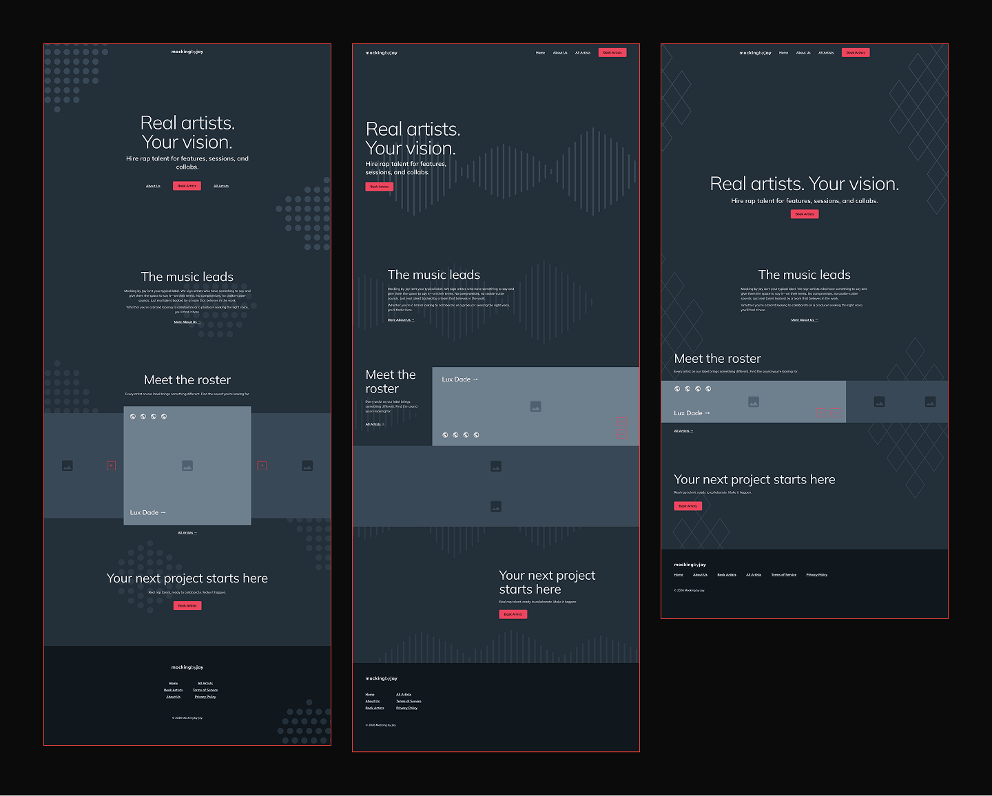
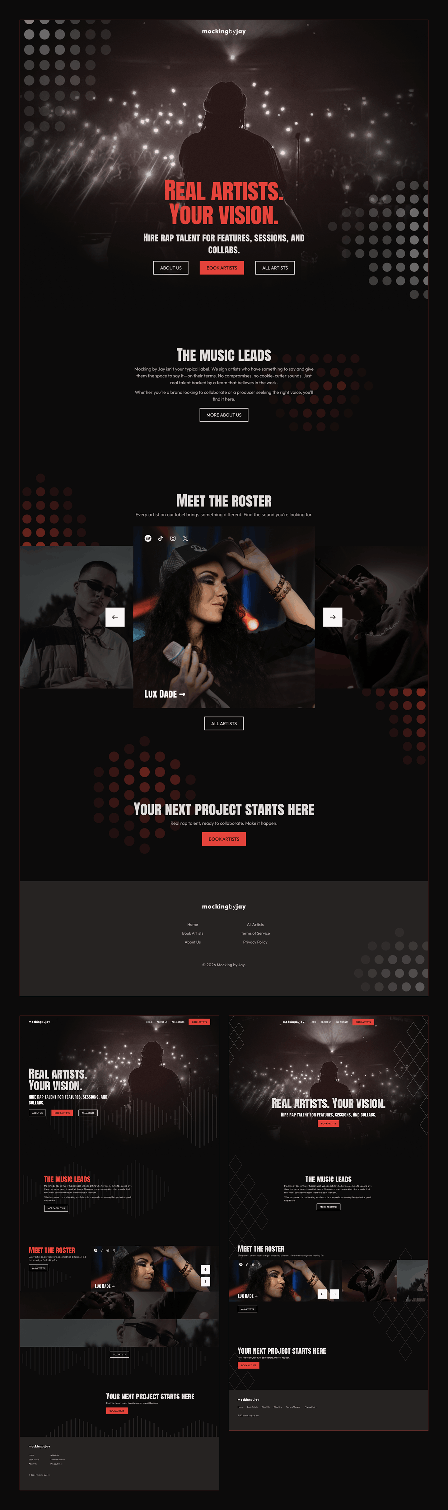
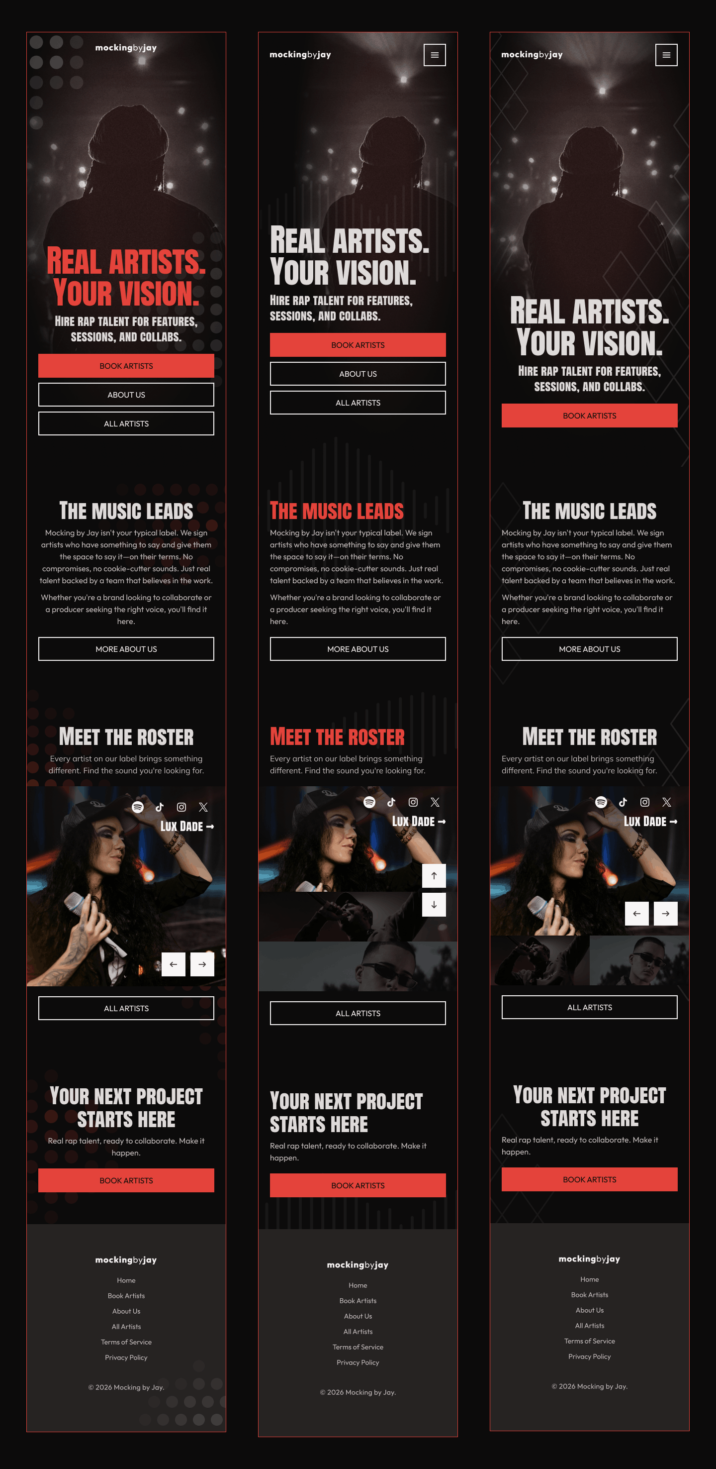
Mocking by Jay Landing Page
Three variations of a full landing page design for a record label, in desktop and mobile format. Each landing page includes a hero section, about section, artists section, and call-to-action. Designed in Figma.


Process and Thoughts
Mocking by Jay is a record label focused on rap music. The brand's goal is to get people to book their artists for recording sessions and live events, and they want the tone to feel independent, urban, and chill, using a color palette focused on red and black. They also want the design to be minimalist and clean, not cluttered with images or photos. Their main call-to-action is to book artists for recording and/or events, but they also want to direct users to learn more about the label and their artists.
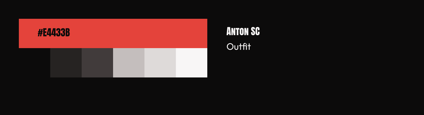
I decided to do three variations of the landing page, for personal practice and to offer options and ideas. I researched the designs of record label websites, gathering inspiration on content and layout. I sketched wireframes by hand to get an idea of layout, then created full wireframes in Figma, adding text to match the desired tone. I used three variations of a motif for background patterns, focusing on geometric shapes to ensure consistent patterns and match a clean interface. I picked a primary red color, then built out a grayscale palette for the remaining neutrals. Black is used for the background, white for text, and red for primary buttons or headings. As the brand stated they wished for artists to stand out, I picked typography that matches a loud personality, as well as images of artists that demonstrated energy and character. Then, I designed the full landing pages in Figma, combining the wireframes with the final color, typography, and images.